Visual iD, Naming & Branding
Visual iD, Naming & Branding
Visual iD, Naming & Branding
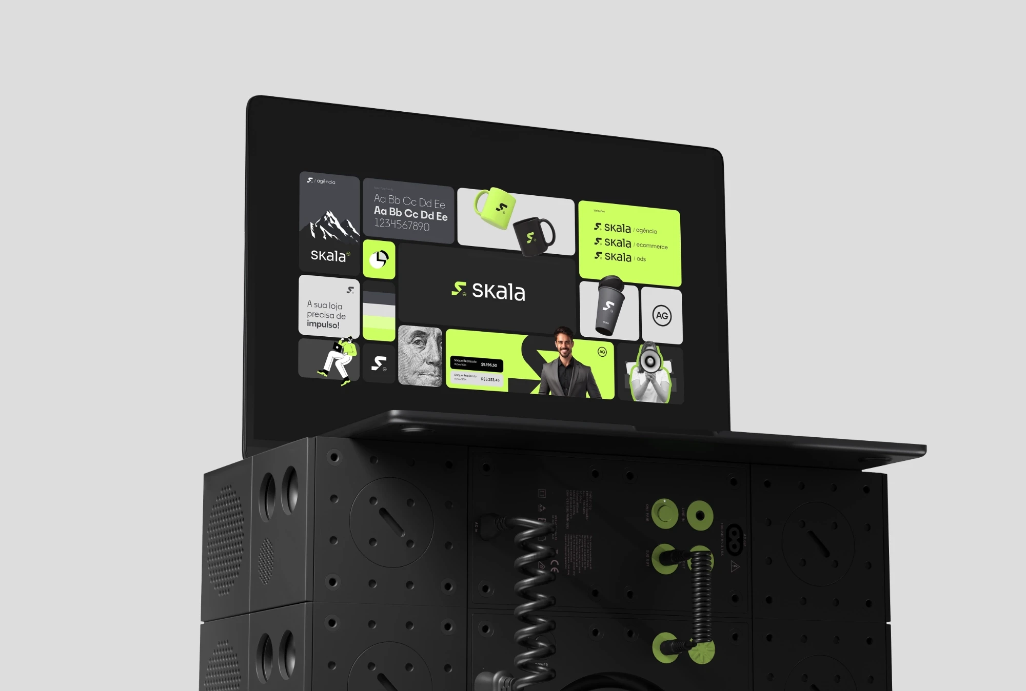
We refined the agency's identity with a modern approach. Our central concept focused on a more refined and elegant color palette that conveys the brand's values through a scale that reflects positivity and profitability. The shape of the letter S was inspired by an upward-trending scale graph. This visual choice represents the positive and progressive momentum associated with the brand, reinforcing the idea of growth and success.
We refined the agency's identity with a modern approach. Our central concept focused on a more refined and elegant color palette that conveys the brand's values through a scale that reflects positivity and profitability. The shape of the letter S was inspired by an upward-trending scale graph. This visual choice represents the positive and progressive momentum associated with the brand, reinforcing the idea of growth and success.
We refined the agency's identity with a modern approach. Our central concept focused on a more refined and elegant color palette that conveys the brand's values through a scale that reflects positivity and profitability. The shape of the letter S was inspired by an upward-trending scale graph. This visual choice represents the positive and progressive momentum associated with the brand, reinforcing the idea of growth and success.
Visual Design
UI & UX Design
We conducted comprehensive brand research to achieve this exceptional result. We navigated through a variety of ideas and concepts, carefully refining them to identify the one that most faithfully represents the essence of our brand. The performance graph was chosen for its unique harmony with the idea of preserving the initial and its visual proportion.
Teccio is the term we adopted to describe this neon green-yellow hue, which embodies a futuristic feel and adds a distinctive characteristic to our visual identity. Meanwhile, our shade of gray directly harmonizes with the primary color, serving as a counterbalance to balance the visual identity. This strategic choice contributes to a cohesive and balanced aesthetic, reinforcing the consistency and sophistication of our brand.

